Personal Branding Prompts: Consistent Visual Identity
Develop a consistent visual style for your personal brand across multiple photos with Nano Banana. Master color grading and aesthetic consistency.
Building a personal brand requires consistency. If your Instagram feed or website looks like a random collection of photos, it dilutes your message. Nano Banana can help you create a unified "visual signature" across all your images, making them instantly recognizable as yours.
Understanding Visual Identity
A visual identity is built on three pillars: Color Palette (your brand colors), Lighting Style (moody vs. bright), and Environment (minimalist vs. organic). By defining these in a "Master Prompt," you can apply your brand to any new photo.
The Starting Point
To get the best results, start with a high-quality, natural photo. A simple selfie with good lighting is the perfect foundation for applying your brand style consistently.

Brand Consistency

[Subject Image] Apply a consistent "Teal & Orange" personal brand style. Preserve: - Subject identity and pose - Key content elements (laptop, coffee, etc.) Transform Style: - **Color Grade**: Cinematic "Teal & Orange" look (teal shadows, warm orange highlights) - **Lighting**: Golden hour backlighting (warm rim light) - **Contrast**: High contrast, punchy blacks - **Saturation**: Vibrance +20, slightly desaturated greens Brand Elements: - **Background**: Urban modern setting (blurred) - **Accent**: Add subtle teal light leak in corner - **Vibe**: Energetic, modern, cinematic
Why This Works
The "Teal & Orange" Grade: This is the most famous color combination in cinema because skin tones (orange) sit opposite to teal on the color wheel, creating natural contrast. Asking for this specific grade instantly makes photos look "produced" and cohesive.
The "Light Leak" Accent: Adding a specific artifact like a "teal light leak" or "lens flare" acts as a visual watermark. If every photo has this subtle element, they will look like a set, even if the subjects are different.
The "High Contrast" Vibe: Defining contrast and saturation levels ensures that some photos aren't washed out while others are dark. Consistency in dynamic range is key to a grid layout.
Common Mistakes
Note:
Over-Branding: Don't ask for "Subject wearing a shirt with my logo." AI is bad at specific logos. Instead, ask for "Subject wearing a shirt in my brand color (Hex #FF5500)." Color is a stronger brand signal than a blurry logo.
The Tech Minimalist
Clean, sharp, and futuristic.

[Subject Image] Apply "Tech Minimalist" brand style. - **Palette**: Monochromatic Black, White, and Grey - **Accent**: Single "Cyber Blue" neon accent light - **Background**: Pure white or concrete texture - **Lighting**: Soft, shadowless "Apple style" product lighting - **Vibe**: Clean, precise, innovative
What Changed: We removed the warm tones entirely and focused on "monochromatic" and "shadowless" lighting for a clean tech look.
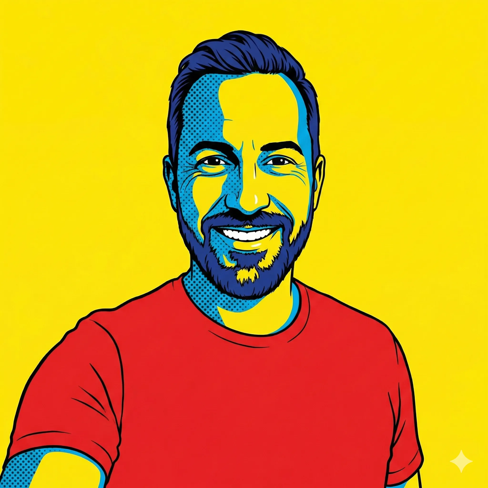
The Pop Art Vibrant
For bold creators and artists.
[Subject Image] Apply "Pop Art" brand style. - **Palette**: Primary colors (Red, Blue, Yellow) - **Saturation**: High saturation, bold colors - **Background**: Solid bright color block - **Lighting**: Hard flash photography (fashion style) - **Vibe**: Fun, loud, energetic
Troubleshooting
Next Steps
- Text & Design: Add typography to your branded photos.
Related Articles
Nano Banana Limitations & Constraints: Know What to Expect
Understand Nano Banana's constraints: knowledge cutoff, file limits, technical specs, and when to use alternative tools.
Context Compression: Reduce Tokens Without Losing Quality
Compress prompts for lower cost and latency using LLMLingua, selective context, and summarization. Learn compression ratios, quality tradeoffs, and when not to compress.
Modern Digital Anime SREF Codes for Midjourney
Master modern digital anime SREF codes for Midjourney. Create contemporary animation styles with smooth digital rendering, modern color techniques, and current production aesthetics.