Infographics & Diagrams: Nano Banana Prompts
Create educational graphics, process diagrams, and data visualizations with Nano Banana. Turn complex data into clear visuals.
Nano Banana excels at creating structured diagrams and infographics—process flows, timelines, charts, anatomy diagrams, and mind maps. The key to success is being explicit about layout and positioning so the AI organizes elements correctly instead of hallucinating random shapes.
Understanding Infographic Structure
The challenge with AI diagrams is precision. You must specify layout (circular, linear, hierarchical), positioning (exactly where labels go), and connections (how elements relate). Without this clarity, the AI fills space randomly.
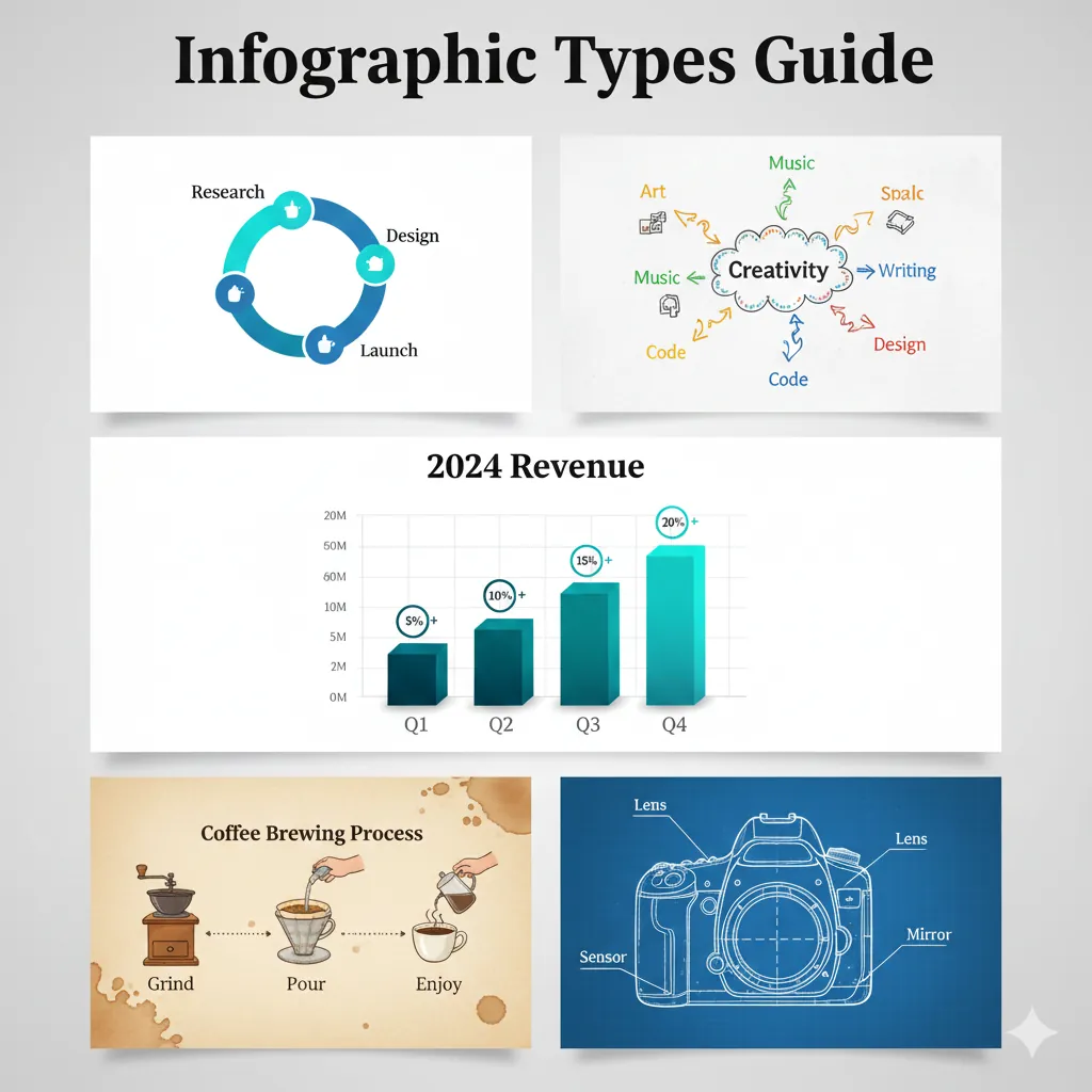
PROCESS FLOW DIAGRAM
Let's start with the foundation example from the Text & Design overview. Here is the complete, fully detailed prompt to generate the "PROCESS FLOW" diagram.
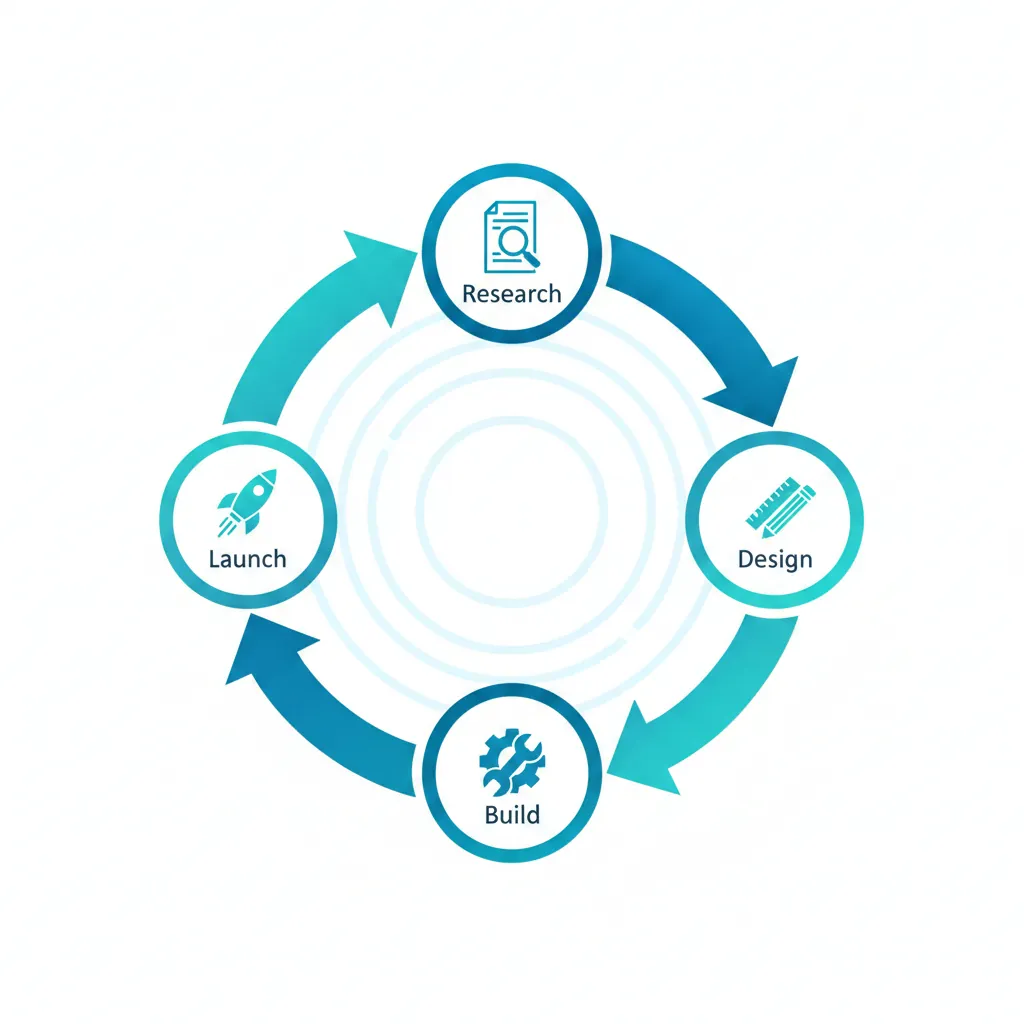
Create a 4-step circular process diagram. Layout: - **Structure**: Circular cycle (clockwise flow) - **Steps**: 4 distinct nodes connected by curved arrows - **Center**: Empty space or central icon Content: - **Node 1 Label**: "Research" (Top) - **Node 2 Label**: "Design" (Right) - **Node 3 Label**: "Build" (Bottom) - **Node 4 Label**: "Launch" (Left) Style: - **Art Style**: Clean flat vector art (corporate Memphis style) - **Palette**: Professional blue and teal gradient - **Background**: White or very light grey - **Icons**: Simple minimal icon for each step
Why This Works
The "Clockwise Flow": Specifying the direction helps the AI organize the arrows correctly. Without this, you might get arrows pointing randomly.
The Positional Labels: Telling the AI exactly where each label goes ("Top," "Right," etc.) prevents text overlapping.
The "Flat Vector Art": This style is standard for infographics because it's clean and scalable. It avoids unnecessary texture that makes text hard to read.
Common Mistakes
Note:
Data Accuracy: Do not use Nano Banana to generate a chart from raw data (e.g., "Graph this CSV file"). It cannot do math. It draws pictures of charts. Use it for qualitative diagrams (concepts), not quantitative data (exact numbers).
The Timeline (Linear)
Show history or steps in order.
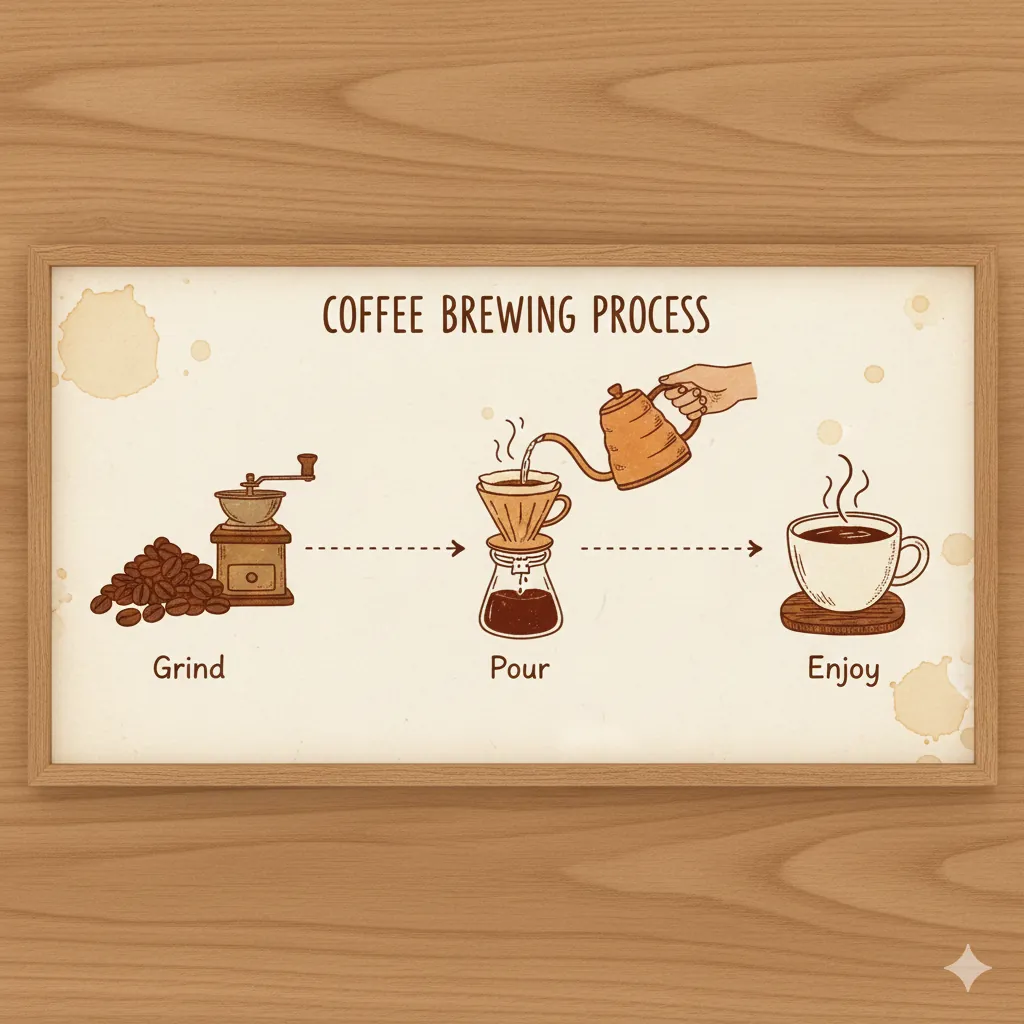
Create a horizontal timeline infographic. - **Topic**: "Coffee Brewing Process" - **Layout**: Left-to-right linear flow - **Step 1**: Coffee beans icon labeled "Grind" - **Step 2**: Pouring water icon labeled "Pour" - **Step 3**: Coffee cup icon labeled "Enjoy" - **Style**: Warm, rustic illustration style - **Connectors**: Dotted line connecting steps
Key Details: Directional keywords ("left-to-right") help the AI sequence steps correctly. Specific connector styles ("dotted") prevent random arrows. Keep labels minimal (1-2 words)—visuals should do the heavy lifting. Style keywords like "rustic illustration" match the design personality to the subject matter.
The Bar Chart (Comparison)
Visualize growth or comparison.
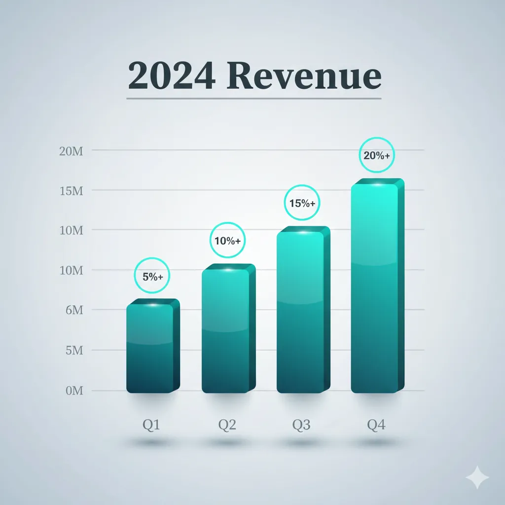
Design a visually sophisticated bar chart visualization. Layout: - **Title**: "2024 Revenue" in bold, modern serif font at the top with a subtle underline - **Axes**: X-axis labeled "Q1, Q2, Q3, Q4" | Y-axis with tick marks and values - **Data**: 4 bars of increasing height (strong upward trend) with subtle shadows Visual Enhancement: - **Bar Colors**: Use a gradient from deep teal to vibrant cyan across the bars, creating a left-to-right progression - **Depth**: Add soft drop shadows beneath each bar for 3D effect - **Accents**: Place small circular badges or icons above each bar showing growth percentages - **Grid**: Include subtle horizontal gridlines in light grey for reference - **Background**: Soft light grey gradient (not pure white) for sophistication Style: - **Overall Aesthetic**: Premium corporate with modern flair (3D render with polished finish) - **Typography**: Clean sans-serif for labels, bold serif for title - **Polish**: Glossy bar surfaces with subtle light reflection
Key Details: Organize prompts into Layout, Visual Enhancement, and Style for clarity. Use color gradients and visual accents (badges, gridlines) to add polish. Describe the visual appearance of data trends (upward trajectory, gradient progression) not calculations—Nano Banana renders pictures, not math.
The Anatomy Diagram (Medical/Technical)
Label parts of an object.
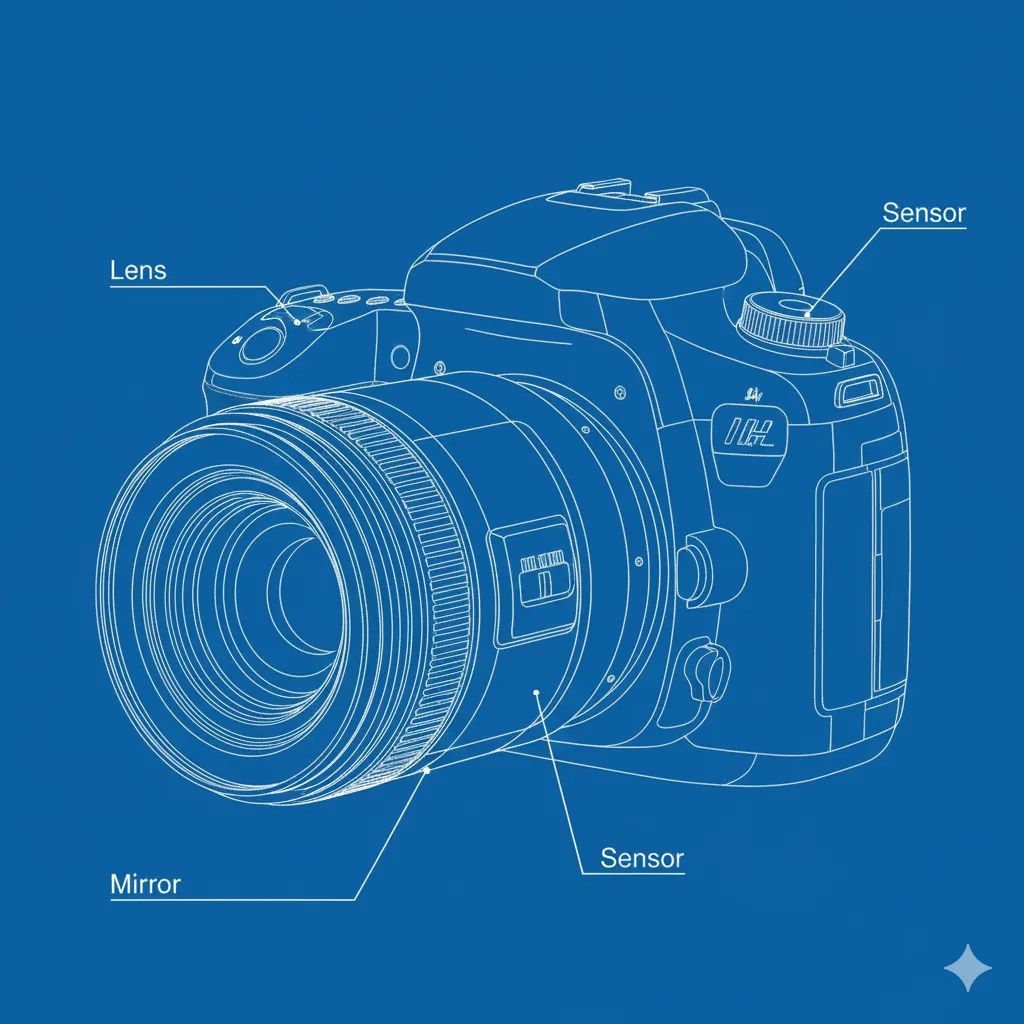
Create a labeled anatomy diagram of a DSLR camera. - **Subject**: Cutaway view of a camera lens - **Labels**: Lines pointing to "Lens", "Sensor", "Mirror" - **Style**: Technical blueprint or line drawing - **Background**: Blueprint blue or clean white - **Detail**: High precision technical illustration
Key Details: Use "cutaway view" to show internal structure—it prevents flat external views. "Label lines pointing to" gives the AI a clear visual pattern for annotations. Technical style (blueprint or line drawing) signals precision over realism. Blueprint blue reinforces technical authenticity.
The Mind Map (Brainstorming)
Visualize connected ideas.
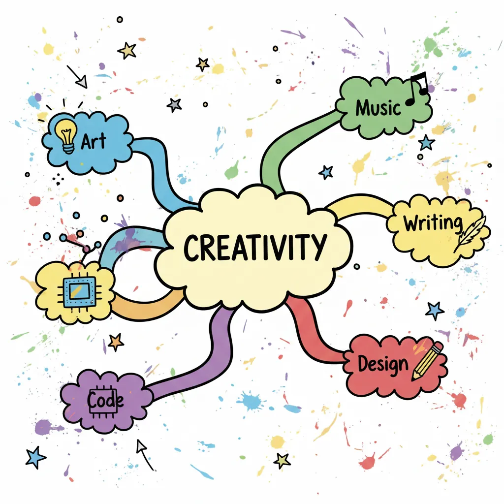
Create a creative mind map diagram. - **Central Node**: "Creativity" in a cloud shape - **Branches**: 5 colorful branches radiating outward - **Keywords**: "Art", "Music", "Writing", "Code", "Design" - **Style**: Hand-drawn marker style on whiteboard - **Vibe**: Brainstorming, energetic, messy
Key Details: A central "cloud shape" node creates a focal point and differentiates the hub from branch nodes. "Radiating outward" guides the layout symmetry and prevents the AI from arranging branches randomly. "Colorful branches" add visual distinction between ideas. "Hand-drawn marker style" keeps the mood informal and brainstorm-friendly, not corporate.
Troubleshooting
Next Steps
Related Articles
Midjourney Historical Figures: Period-Accurate Portraits
Create authentic Egyptian pharaohs, medieval knights, and Renaissance nobles with Midjourney. Period-specific prompts with accurate details, clothing, and settings.
Architectural Minimalism SREF Codes
Clean spaces, essential structures, and architectural reduction with precise geometry and brutalist simplicity.
Line Art & Outline Minimalism SREF Codes
Clean line work with minimal detail, precise outlines, and maximum clarity through simple strokes.