GPT Image 2 Anime Poster and Mecha Key Visual Prompts
Build anime posters, mecha key visuals, pixel sprite sheets, and game screenshots with GPT Image 2 using layout budgets and identity locks.
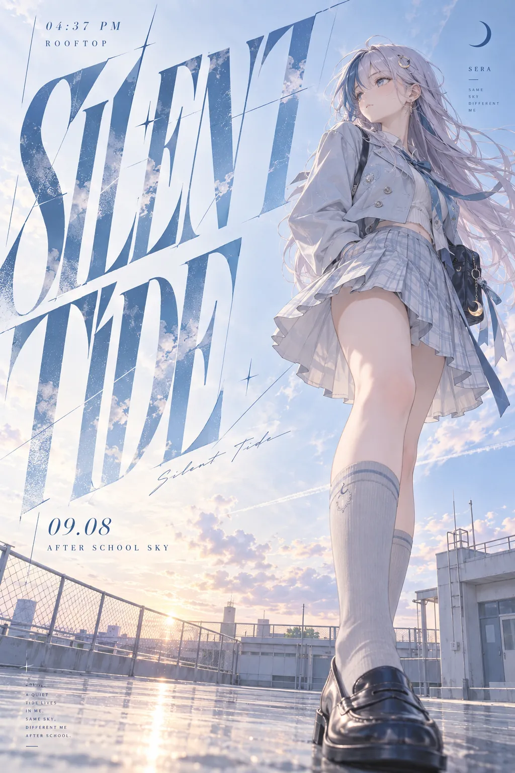
Anime prompts fail the same way landscape prompts do: everything gets described and nothing gets prioritised. The figure, the wordmark, the background, and the effects all arrive at full strength, so the result reads as an illustration with text on it rather than a designed poster.
The fix is a layout budget — state what fraction of the frame each element owns before describing any of them. Once the type is budgeted at half the canvas and the figure at a third, the background has nowhere to go, and the composition resolves itself.
These prompts all use original characters. Every one of them is written so you can swap in your own character name and keep the structure.
The five parts of an anime poster
This architecture came out of a documented failure: someone chasing a monochrome style, missing it, and landing a repeatable poster template instead. It holds because each part does one job.
- Give the figure about a third of the frame. Small enough that the poster reads as a design object. A full-height character turns it back into a character illustration.
- Give the wordmark half to two-thirds. Oversized, slanted, stretched, slightly misregistered, with edges cut. It should be the loudest thing in the image.
- Drop the camera to ankle height and shoot up. A low camera near the calf produces depth and makes the standing figure feel like it has presence.
- Re-cut the costume, don't copy it. Take the original design language and re-interpret it as something with higher finish. Copying the source outfit gives you fan art; reinterpreting gives you a poster.
- Budget the background as empty space. A dusk sky or a plain rooftop costs nothing and gives the type somewhere to sit.
Budget the negative space the same way. A large quiet field is what makes an oversized wordmark legible.
Six prompts
Type-dominant poster with a low camera
The canonical layout. One giant phrase carries the design, the figure anchors the lower third, and the camera does the rest.
2:3 vertical anime art poster, modern Japanese graphic design, minimal, refined, and immediately readable. Layout budget: the figure occupies about one third of the frame; the main graphic wordmark occupies about two thirds. Strong layout discipline and fashion-poster quality. The character is SERA, an original character: a clearly adult woman in her early twenties, a university student, with long silver-lilac hair carrying one dark teal streak at the front, ice-blue eyes, and a small crescent-moon hairpin. Reserved, slightly distant temperament. Her outfit reinterprets the character design language as a refined academy look: an ice-blue and white cropped wool jacket with a slim inner top, a short pleated skirt, and pale grey knee socks with clean loafers. Light, translucent, elegant, fully clothed. Camera: extremely low, near the calf, angled upward. Strong depth and long-leg perspective. One leg closer to the lens, natural foreshortening, convincing angle. She stands on a school rooftop after classes, weight even, standing naturally or slightly turned, legs relaxed and slightly inward, posture quiet and composed. Hair and skirt lifted a little by the breeze. She looks level into the distance, expression calm with a trace of cool detachment. Setting: a rooftop after school, bright evening sky, large area of empty space, simple environment with only a little wire mesh, railing, floor lines, and the distant outline of a school building. Clean, airy, transparent rooftop atmosphere. Main visual: one very large art wordmark reading "SILENT TIDE". The letters are dramatically slanted, narrow and stretched, slightly misregistered, with cut edges, occupying most of the left-to-centre area and balancing the figure with strong contrast. Small supporting text may read "04:37 PM", "ROOFTOP", "09.08", "AFTER SCHOOL SKY" — restrained, refined placement for a magazine-cover feel. Palette: ice blue, mist white, pale lilac-blue, a little silver grey. Bright and transparent, cool and soft, quiet and clean. Overall: a trend poster, a graphic design piece, an anime fashion campaign poster.
Why it works: the fractions come before the description. Once the wordmark owns two thirds of the frame, the model has to clear space for it, and the background detail you would otherwise get floods silently. Naming the exact phrase and four micro-captions keeps the type block closed.
Mecha as a scaled identity symbol
The second half of the same template family. The machine is not a prop — it is the character's colour system, element, and status symbols enlarged, and the human standing at its knee supplies the scale contrast.
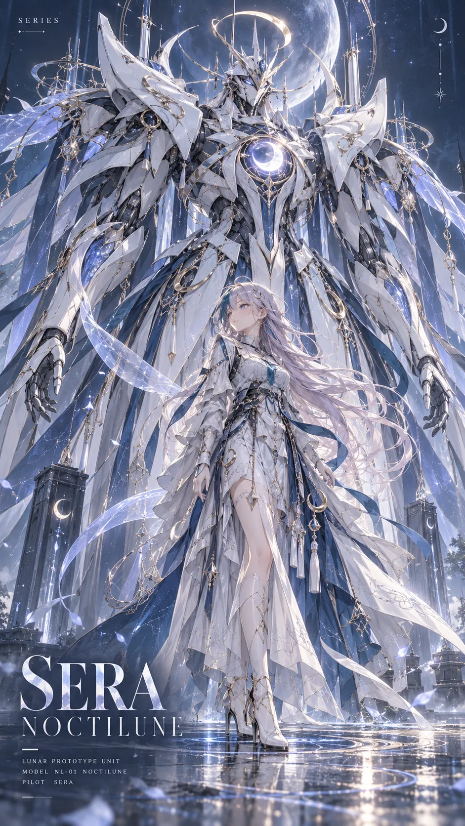
9:16 vertical high-end game character mecha poster. Original character SERA and her dedicated giant mecha. This must be official-grade, premium, collectible key-visual poster quality — not a casual illustration. Preserve SERA's most recognisable traits: silver-lilac hair with one dark teal streak, ice-blue eyes, the crescent-moon hairpin, and her calm reserved temperament, so she reads instantly as herself. Do not copy her clothing directly; re-interpret her design language into something refined, ornate, and restrained, with couture finish. The mecha is full-body and enormous. SERA stands in front of it and reaches only to about its knee, creating a strong body-size contrast. The mecha is not an ordinary robot: it is SERA's own colour system, elemental idea, identity symbols, and design language scaled up into a shrine-like couture machine. Match its silhouette, colour system, decorative structure, and energy expression to her. Ornate, powerful, elegant, and sacred. Premium metal, enamel armour, carved filigree, a glowing core, partial translucent energy structures, refined edging. No crude military look, no wasteland grit, no plastic-toy feel. Background: deep blue-grey minimal poster ground with a faint cool light and a few star points or particles. Contact shadow at the feet, a faint reflection, elemental particles, and a small energy base so both figures sit on the ground. Cinematic game-poster lighting: clear subject, defined rim light, refined and complete. Typography block, restrained: small text at top left reading "SERIES", the character name and mecha name at lower left, one to three lines of small technical text near the bottom. High-contrast serif for the main title, fine uppercase sans for small text. It must look like official collector-grade poster design.
Why it works: "she reaches only to about its knee" is the whole prompt — that single line creates the scale that makes both figures read as one composition. Describing the machine as the character's own symbols enlarged stops it from becoming generic military hardware, and forbidding the source outfit keeps the result off fan-art territory.
Pixel-art battle sprite sheet
The most specified prompt in this set, and the most useful for anyone building a small game. It works because every ambiguity that would break a sprite sheet is closed: exact grid, playback order, cell size, registration, transparency, and a loop that has to close.
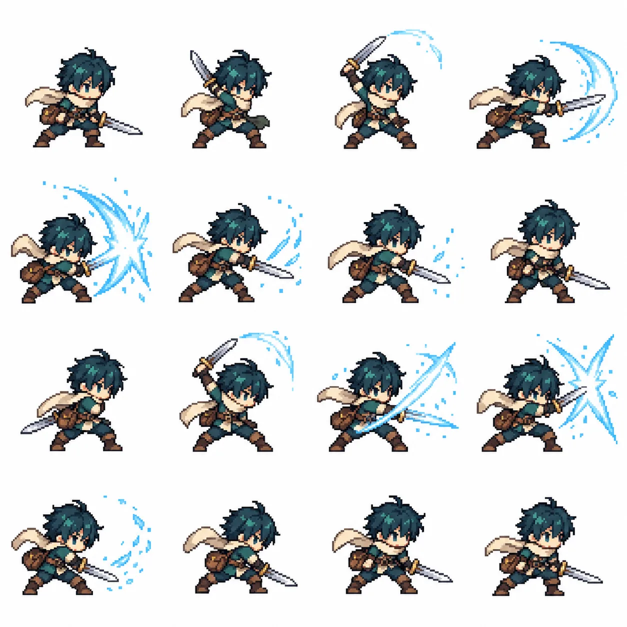
Using the character reference I attach, create a pixel-art battle animation. Deliver one 4x4 sprite sheet of 16 sequential frames, plus a transparent animated GIF. Character fidelity: read the character's hairstyle, clothing, colours, weapon, proportions, and distinctive features, and translate them into a recognisable chibi pixel sprite. Keep the character's identity, proportions, clothing, and equipment consistent across all 16 frames. Battle design: if the character has an established attack, use it. Otherwise design one attack that suits them. If they carry a weapon, build the animation around that weapon. If they have a recognisable power, use an appropriate effect such as water, fire, or lightning. If the power is unclear, create a plausible physical attack based on their appearance. Do not invent unrelated powers. Ask no preliminary questions; proceed to build a coherent battle loop. Combat cycle: ready stance, anticipation, attack, impact peak, effect dissipate, recover. Distribute the sequence naturally across the 16 frames. The final frame must transition smoothly into the first. The animation must change real poses and body mechanics; do not fake motion by only panning or rotating a static character image. Pixel-art style: clean 16-bit game pixel art with readable silhouettes, sharp pixel edges, and a restrained palette. Consistent pixel scale for character and effects. Avoid blur, photorealistic rendering, and style drift. Sprite sheet requirements: - Exactly 4 columns by 4 rows, 16 frames total. - Frames play left to right, then top to bottom. - All cells identical in size. - Fixed camera, consistent character scale, stable ground baseline, consistent animation registration. - Exactly one character per cell. - Keep the whole body, weapon, and effects inside the cell. - Leave transparent padding on every side. Nothing may cross a cell boundary or be clipped. - No text, frame numbers, grid lines, watermarks, or background scenery. Transparency and animation: produce a genuine transparent RGBA PNG. Never draw a checkerboard pattern to fake transparency. Slice the sheet into frames and assemble a transparent, infinitely looping GIF. Tune frame durations to emphasise anticipation and the fast strike, targeting a total loop of roughly 1.5 to 2 seconds. Preserve full alpha in the PNG, and use a transparent palette index with correct frame disposal in the GIF so the previous frame does not ghost. Deliverables and check: create actual files, not just a prompt or an explanation. 1. A transparent 4x4 PNG sprite sheet. 2. A playable transparent battle GIF. 3. A ZIP of all 16 individual transparent PNG frames. Before delivering, verify there are exactly 16 frames, the transparency is real, the character stays consistent, adjacent frames do not bleed into each other or get clipped, the motion plays in the correct order, and the loop has no visible jump. Fix anything wrong before showing the GIF preview and download links.
Why it works: the value is entirely in the constraint list. "Frames play left to right, then top to bottom," "one character per cell," and "never draw a checkerboard to fake transparency" each remove a specific failure. The requirement that motion change real poses rather than panning a static sprite is what separates an animation from a slideshow.
Game screenshot with in-world interface
A different genre: not an illustration of a game, but a frame from inside one. The interface has to look functional, not decorative.
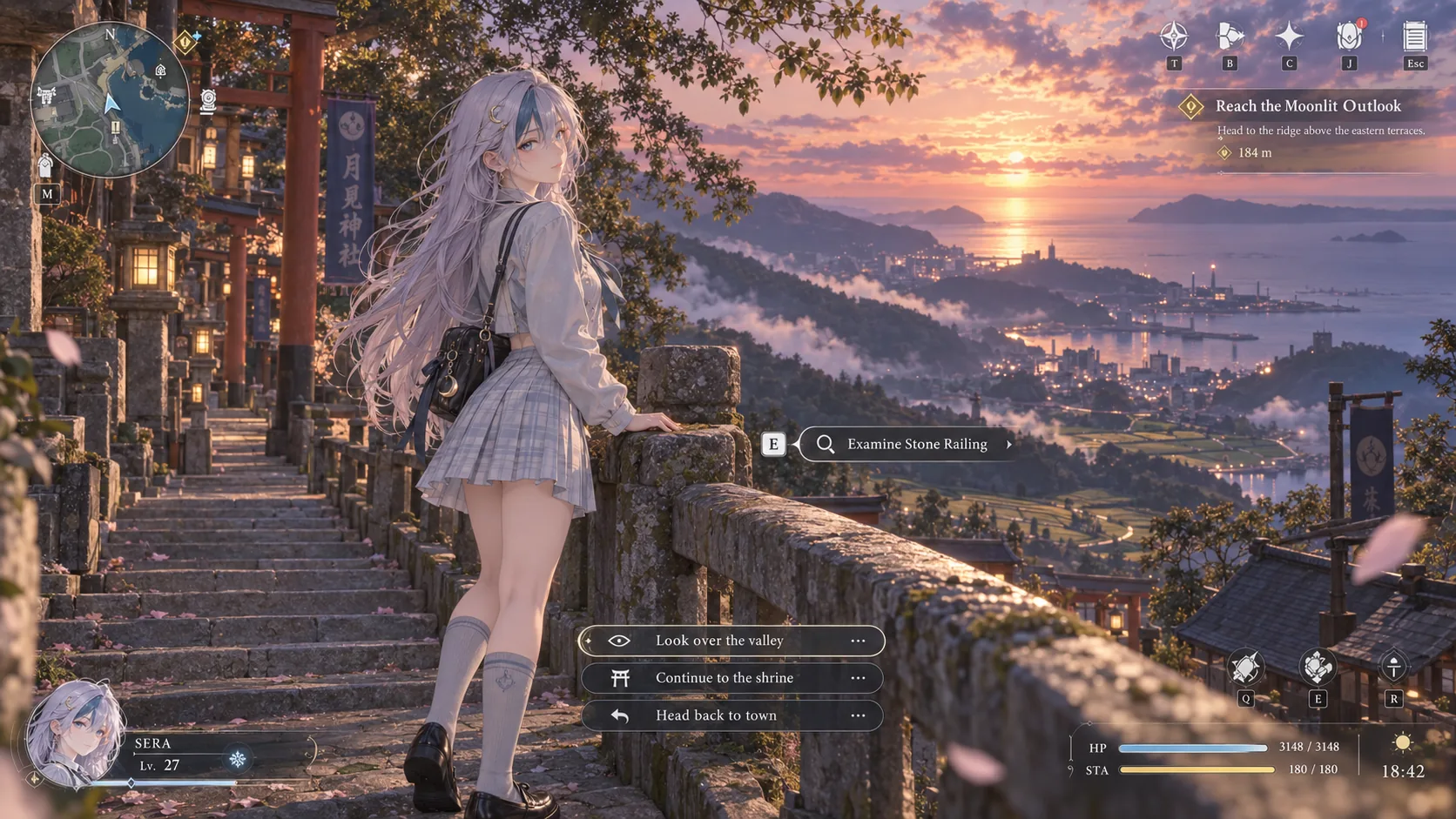
Please generate an actual screenshot from a fictional next-generation 3D anime-style open-world RPG, from a third-person over-the-shoulder perspective. The scene is a coastal hillside shrine path at dusk. The player character, SERA — silver-lilac hair with one dark teal streak, ice-blue eyes, crescent-moon hairpin, in a re-interpreted academy outfit — has just stopped on the stone steps, seen from behind and slightly to the side, one hand resting on a stone railing. Beyond her, a wide valley of terraced fields, low clouds, and a distant coastline under a peach and violet sunset. Rendering: high-quality next-generation anime-style 3D graphics with current-generation character modelling, cinematic lighting, realistic skin shading, and expressive facial detail. The screenshot must include a fully playable RPG interface, integrated into the world and not floating as a separate overlay: a minimap in the top corner, quest objectives with a tracked entry, dialogue choice buttons, interaction prompts, character portrait, relationship affinity indicators, and player status bars with health, stamina, and a clock. Typeface and iconography should read as a shipped game UI, consistent and legible. Overall presentation: a polished AAA anime open-world RPG with cinematic depth of field, volumetric light through the trees, and detailed UI design. It must read as a real game screenshot the player captured mid-play, not as concept art and not as a menu.
Why it works: "integrated into the world and not floating as a separate overlay" is the instruction that keeps the interface from becoming a graphic-design plate. Listing the actual HUD regions — minimap, tracked quest, dialogue choices, interaction prompt, portrait, affinity, status — gives the model a checklist, and asking it to read as a frame the player captured is what keeps it from becoming a poster.
Deliberately failed photographs
An inverted technique. Instead of describing what you want, you enumerate the specific ways an image goes wrong and ask for all nine at once. The result is a diagnostic sheet: one clean prompt, nine known defects, all recognisable.
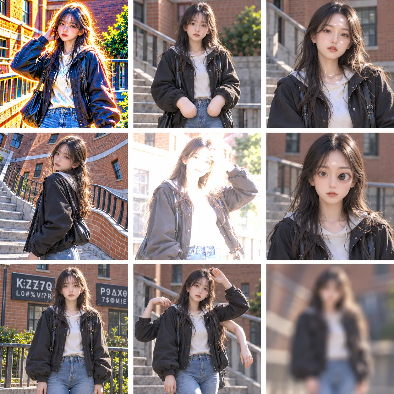
A 3x3 contact sheet of nine BADLY BROKEN AI-generated photographs, separated by thin white gutters. Every panel must look visibly defective and cheap. The subject in all nine is the same adult woman in her early twenties, in a plain dark jacket, white top and jeans, standing outdoors by a brick building with a stair rail. All panels fully clothed. The single most important rule: each panel must display one OBVIOUS, GLARING mistake that a viewer can spot instantly. No panel may look clean or well-rendered. Do not make any of these look attractive or professional. Panel 1 — HDR halos: every edge outlined with a glowing white-orange rim light. Severe oversaturation. Burning highlights. Panel 2 — Fused hands: both hands melted into shapeless mittens, fingers completely fused, thumbs merging into palms. No fingers visible at all. Panel 3 — Waxy plastic face: skin smoothed into a shiny airbrushed doll surface. No pores whatsoever. Wet-looking plastic sheen on the forehead and cheeks. Panel 4 — Warped architecture: the brick wall and stair rail bend and twist at impossible angles, leaning like melted cardboard. Panel 5 — Destroyed exposure: massive blown white areas across the face and background with zero detail, like an overexposed phone photo. Panel 6 — Wrong face: mask-like perfectly symmetrical features with mismatched eyes, one noticeably larger and set wrong, unsettling doll stare. Panel 7 — Gibberish text: large black signs behind her filled with scrambled unreadable fake letters and nonsense characters. Panel 8 — Broken anatomy: a clearly extra arm growing from her shoulder, three arms visible. Panel 9 — Total mush: extreme blur across the whole panel, no sharp edge anywhere, smeared and low-detail. Same framing and subject scale in all nine panels so the mistakes are the only difference. No captions, no labels, no numbers, no watermark.
Why it works: this inverts the usual job. Instead of excluding flaws in a negative list, it asks for them as content. Two things make it work, and both were learned by failing first. Describe each defect glaringly and physically — "fingers completely fused, no fingers visible at all" lands where "melted hands" does not. And open with a blanket refusal clause — "no panel may look clean or well-rendered" — because the model's default is to produce nine attractive photographs and bury the defects. Without that line, several panels come back looking good and the sheet stops working.
1990s cel animation
Every anime prompt written recently assumes the current default: soft digital gradients, bloom, and 3D shading. Asking for a specific era's rendering grammar is a matter of naming what that era did not have.
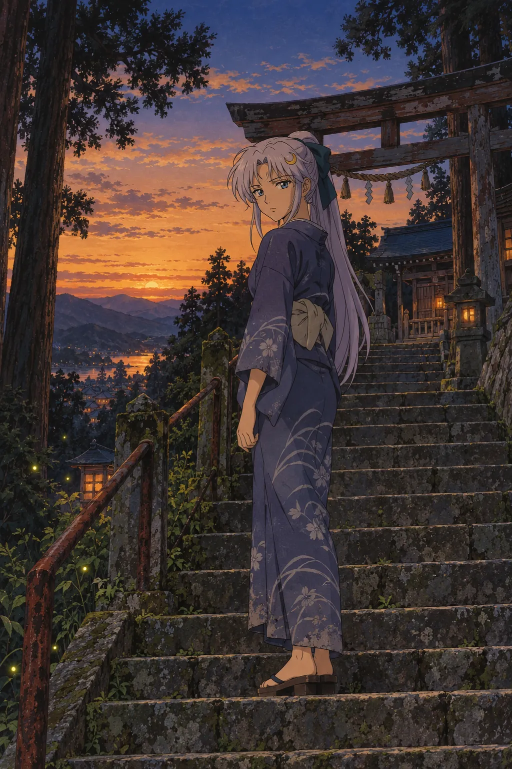
A 1990s hand-painted cel animation frame, vertical 2:3. The rendering grammar of late-1980s to mid-1990s television anime, not modern digital illustration. Rendering rules: flat colour fills with visible ink linework of varying weight, two or three tone cel shading with a hard terminator line, painted background art with visible brush texture, a limited warm-dusk palette, gentle film grain, slight gate weave, and no modern bloom, no volumetric light rays, no lens flare, no depth-of-field blur, no glossy 3D shading. Subject: a clearly adult woman in her early twenties, a shrine attendant, standing partway up a weathered stone stairway. Long silver-lilac hair tied with a dark teal ribbon, ice-blue eyes, a crescent-moon hairpin. She wears a simple muted indigo work kimono with a faded pattern, an obi tied plainly, and wooden geta. Fully clothed, practical, worn at the hem. Setting: a hillside shrine at dusk in late summer. Stone steps worn smooth, a rusted iron handrail, moss in the joints, a weathered wooden torii at the top of the flight, tall cedars, cicadas suggested by the still air and warm light. The sky is graded from amber at the horizon to deep blue overhead. A few fireflies begin to show in the shadows. Camera: a quiet medium-long shot from a few steps below her, level and static, with a flat composition and generous sky. Expression: she has paused and is looking back over her shoulder toward the bottom of the steps, thoughtful, not smiling. The frame should read as a single cel from a produced series: confident line work, restrained colour, and a held pose rather than an action moment.
Why it works: "the rendering grammar of late-1980s to mid-1990s television anime, not modern digital illustration" sets the period, but the rule list does the work — flat fills, two or three tone shading, hard terminator line, and then an explicit exclusion of bloom, flare, DOF, and 3D shading. Naming what the era did not have is what stops the model defaulting back to the modern look.
Swap the subject, keep the frame
Both poster templates are built so the character is a variable. This is what makes them worth one prompt rather than one image.
| Move | What stays | What changes |
|---|---|---|
| Poster to mecha | identity anchors, colour system, poster frame | human becomes a full figure beside a scaled machine |
| Poster across characters | the whole layout budget and typography block | four anchors: hair, eye colour, motif, temperament |
| Retro cel to modern | subject, setting, pose | swap the rendering rule list |
| Screenshot to illustration | the world and the moment | remove the HUD, restage as a key visual |
| Sprite sheet to idle | grid, cell size, registration, transparency | replace the attack cycle with a breathing loop |
A reusable prompt order
| Prompt block | Specify | Example |
|---|---|---|
| Frame | aspect ratio and language | "2:3 vertical" |
| Layout budget | the share of the frame each element owns | "figure one third, wordmark two thirds" |
| Camera | height, angle, and what it does to perspective | "low, near the calf, angled up" |
| Identity | three or four anchors, then temperament | "silver-lilac hair, teal streak, ice-blue eyes" |
| Costume rule | re-interpret the design language, do not copy | "academy reinterpretation, fully clothed" |
| Setting | one location plus what to leave empty | "rooftop at dusk, large area of empty space" |
| Type block | one giant quoted phrase plus a few micro-captions | "SILENT TIDE" + "04:37 PM", "ROOFTOP" |
| Palette | three to five colours | "ice blue, mist white, pale lilac, silver grey" |
| Negatives | the era or medium conflicts | "no bloom, no DOF, no glossy 3D shading" |
Two rules carry most of the weight. Budget the layout before describing anything, and name what you do not want in terms of the thing you are avoiding — "no bloom" rather than a generic quality-negative list, because that one names a specific modern default.
All six prompts and their example images were written and generated independently for PromptGenius. Every character is original and described only by ordinary, fully clothed detail. SERA is defined once so you can reuse the same identity anchors across every template in this page — or swap in your own. For the craft-media side of illustration see art styles and media and typography posters.
Related Articles & Guides
 #gpt-image-2
GPT Image 2 Typography Poster Prompts
Create GPT Image 2 posters with real rendered text — letterform grounds, Swiss grids, archival hierarchy, signage, covers, and event key art.
 #gpt-image-2
GPT Image 2 Travel Photo to Fine-Art Poster Prompts
Use one travel photo as the reference for three GPT Image 2 poster styles: rubber stamp, architectural silkscreen, and impasto paint.
 #gpt-image-2
GPT Image 2 Lingerie and Swimwear Portrait Prompts
Direct lingerie and swimwear portraiture with GPT Image 2 using garment construction vocabulary, staging as a decision, and light you can name.